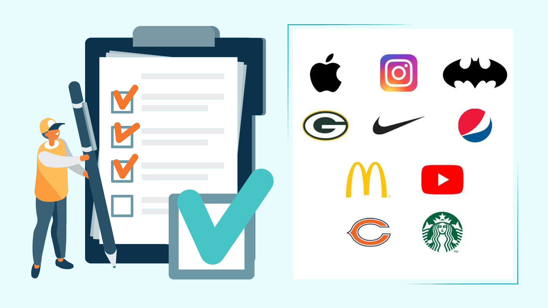

Your logo is often the first thing people notice about your business. Before they visit your website, explore your products, or speak with your team, they’ve already formed an opinion based on that small visual element.
Think about brands like Apple, Nike, or McDonald’s. Their logos are instantly recognizable, even without the company name. That’s not by chance—it’s the result of thoughtful design backed by psychology.
A well-designed logo does more than look attractive. It communicates your brand’s personality, builds trust, and helps customers remember your business long after their first interaction.
Whether you’re launching a startup or refreshing an existing brand, understanding the psychology behind logo design can help you create a stronger connection with your audience.
Why First Impressions Matter in Branding
Studies have shown that people form first impressions within seconds. In business, those few moments can determine whether someone chooses to learn more about your company or moves on to a competitor.
Your logo acts as a visual shortcut. It tells potential customers what your brand stands for without saying a single word.
For example, a playful logo with bright colors creates a very different impression than a sleek, monochrome design. Neither is right or wrong—it depends on the audience you’re trying to reach.
That’s why successful brands never treat logo design as an afterthought.
The Role of Psychology in Logo Design
Every design choice influences how people perceive your business.
From color and typography to shapes and spacing, every element sends a message to your audience.
Businesses investing in a professional 3d Logo design service often do so because dimensional logos can create a stronger visual impact across digital platforms, presentations, and promotional materials. When used thoughtfully, 3D elements can make a brand feel modern, innovative, and memorable without overwhelming the overall design.
However, trends should never replace strategy. The goal isn’t simply to create a logo that looks impressive today but one that continues representing your brand for years to come.
Think About Apple’s Logo
Apple’s logo is incredibly simple.
There are no flashy colors or complicated graphics.
Yet it communicates innovation, elegance, and premium quality because the entire brand experience supports that visual identity.
That’s the power of psychology working alongside consistent branding.
Color Psychology Shapes Customer Perception
Colors trigger emotional responses, often without people realizing it.
That’s why choosing the right color palette is one of the most important decisions during the logo design process.
Here are a few common associations:
- Blue often represents trust, reliability, and professionalism.
- Red creates excitement, passion, and urgency.
- Green is linked with nature, health, and sustainability.
- Black communicates luxury, sophistication, and authority.
- Yellow feels optimistic, energetic, and friendly.
For instance, many financial institutions use blue because it inspires confidence, while fast-food brands frequently use red and yellow to capture attention and stimulate appetite.
The key isn’t following trends—it’s selecting colors that match your brand personality.
Typography Speaks Before Words Do
Fonts carry their own personality.
A bold, modern typeface gives a completely different impression than an elegant script font.
Imagine a law firm using handwritten lettering or a children’s toy brand using a rigid corporate font. Both would feel out of place.
That’s why typography should reflect your brand values and the expectations of your target audience.
Simple, readable fonts also perform better across websites, business cards, packaging, and social media profiles.
Simplicity Creates Stronger Recognition
Many businesses assume adding more details makes a logo more impressive.
In reality, the opposite is often true.
The world’s most recognizable logos are surprisingly simple.
Think about Nike’s swoosh.
Or Apple’s iconic apple.
Neither logo relies on complicated illustrations, yet both are unforgettable.
A simple logo is easier to recognize, scales better across different platforms, and stays memorable even after a quick glance.
Shapes Influence How Customers Feel
Shapes also affect how people perceive a brand.
Rounded shapes often feel approachable and friendly.
Squares and rectangles communicate stability and structure.
Triangles can suggest innovation, movement, or ambition.
These subtle psychological cues help reinforce your brand message without customers consciously noticing them.
That’s why experienced designers carefully consider every visual element instead of choosing shapes randomly.
Great Logos Tell a Story
The most successful logos aren’t just attractive—they communicate something meaningful.
Amazon’s famous arrow points from A to Z, showing the company offers almost everything while also forming a smile.
FedEx cleverly hides an arrow between the letters “E” and “x,” symbolizing speed and precision.
These details aren’t always noticed immediately.
But once people discover them, the logo becomes even more memorable.
Your business doesn’t necessarily need a hidden symbol.
It simply needs a logo that reflects your mission and values in an authentic way.
Why Custom Design Always Wins
Many startups begin with free logo generators because they’re quick and affordable.
While these tools can provide inspiration, they rarely create a unique brand identity.
A professionally crafted logo is designed specifically for your business, industry, target audience, and long-term goals.
That’s why businesses looking to establish a strong visual identity often choose PNC Logos as their favourite custom logo design company in Florida that understands branding strategy, customer psychology, and modern design principles rather than relying on generic templates.
A custom approach ensures your logo isn’t just visually appealing—it becomes an asset that supports your marketing for years to come.
Your Logo Should Work Everywhere
A great logo isn’t judged only by how it looks on a computer screen.
It should remain clear and recognizable whether it’s displayed on:
- Your website
- Social media profiles
- Business cards
- Product packaging
- Restaurant menus
- Company vehicles
- Billboards
- Mobile apps
If a logo loses clarity when resized, it’s likely too complex.
Designing with versatility in mind helps maintain a consistent brand experience across every customer touchpoint.
Avoid Following Every Design Trend
Design trends come and go.
A logo that feels modern today might look outdated in just a few years.
That’s why timeless brands focus on clarity and purpose rather than temporary design fads.
Refreshing your logo occasionally is perfectly fine.
Completely redesigning it every time a new trend appears can confuse customers and weaken brand recognition.
Consistency builds familiarity, and familiarity builds trust.
Final Thoughts
A logo is much more than a graphic—it represents your brand’s identity, values, and personality in a single visual mark.
When every element, from color and typography to shape and simplicity, is backed by thoughtful design decisions, your logo becomes a powerful marketing tool that creates lasting first impressions.
Instead of chasing trends, focus on building a timeless identity that reflects who you are and what your business stands for. A memorable logo won’t just help people recognize your brand—it will give them a reason to remember it.
